I find so much happiness and satisfaction exploring color in various ways and know that is a common experience of many artists. My students are always having fun in class choosing, mixing, and finding that perfect combination of color when presented with a wide array of materials. Professional artist friends also tell me they base entire pieces on a new color they became “obsessed” with and expand their practice in the process. When one thinks of it and imagines the possibilities it’s a bit mind boggling.
As an art instructor I try and use both unusual and standard art supplies, especially when it comes to color. Of course, I have my “go-to” and favorite supplies, yet there are always new ways to experiment with them and incorporate them into different projects and pieces.
Lately I’ve been focusing on representational lessons and projects, and have noticed I’ve been especially drawn toward animal subjects. Which is fantastic, but it hasn’t led to much experimenting in the color department, since I have been limited by my own attempts to keep colors close to the ones seen in real life. Abstract or geometric themed lessons, on the other hand, lend themselves incredibly well to color experimentation. So, it was time to look around me and think “what to do next?”
I certainly have a lot to look at for inspiration. I knew I would find something, with my range of books, my boxes of examples done over the years, and the many stacks of my unfinished ideas. This time it was the materials sparked something. When I opened a drawer and saw my beautiful tissue paper selection, squares of color appeared in my head.
I’ve used tissue paper in previous lessons. It is one of my favorite/go-to materials I mentioned above, for so many reasons: tissue paper is a delicate yet flexible material, it has a transparent quality not many papers have, and there are so many choices of tissue paper colors. I rifled through my choices, picked out those colors that spoke to me, or would companion well with the colors that spoke to me, and broke out the scissors.
I got busy hand cutting squares. It’s important for me to mention “hand” cutting, because these are imperfect squares, freer than exact cut squares. I wanted to have a little edge with the imprecise shapes and bring some more interest to the piece that way.
My preference for a tissue paper binder, or adhesive, is the liquid starch you can find in the laundry aisle of most grocery stores. It dries smoothly, adds a bit of a sheen to the finished art piece, is easy to find, and is very affordable.
It is important to lay down a good coat of that starch on your base paper (background) before you put the tissue piece down. It is also important to move slowly and use a delicate touch while handling tissue paper in every stage of this project. Tissue paper, for all its wonders, is almost weightless and is so very thin, which means it is frail.
I began pasting squares rather randomly for my ground layer, remaining aware of what colors complimented each other and trying to anticipate the newly created color result of the overlay. I became fixed on the balance, the positive and negative space of my squares while this piece became less of a geometric study and developed into more of a color theory, color mixing, and discovery process.
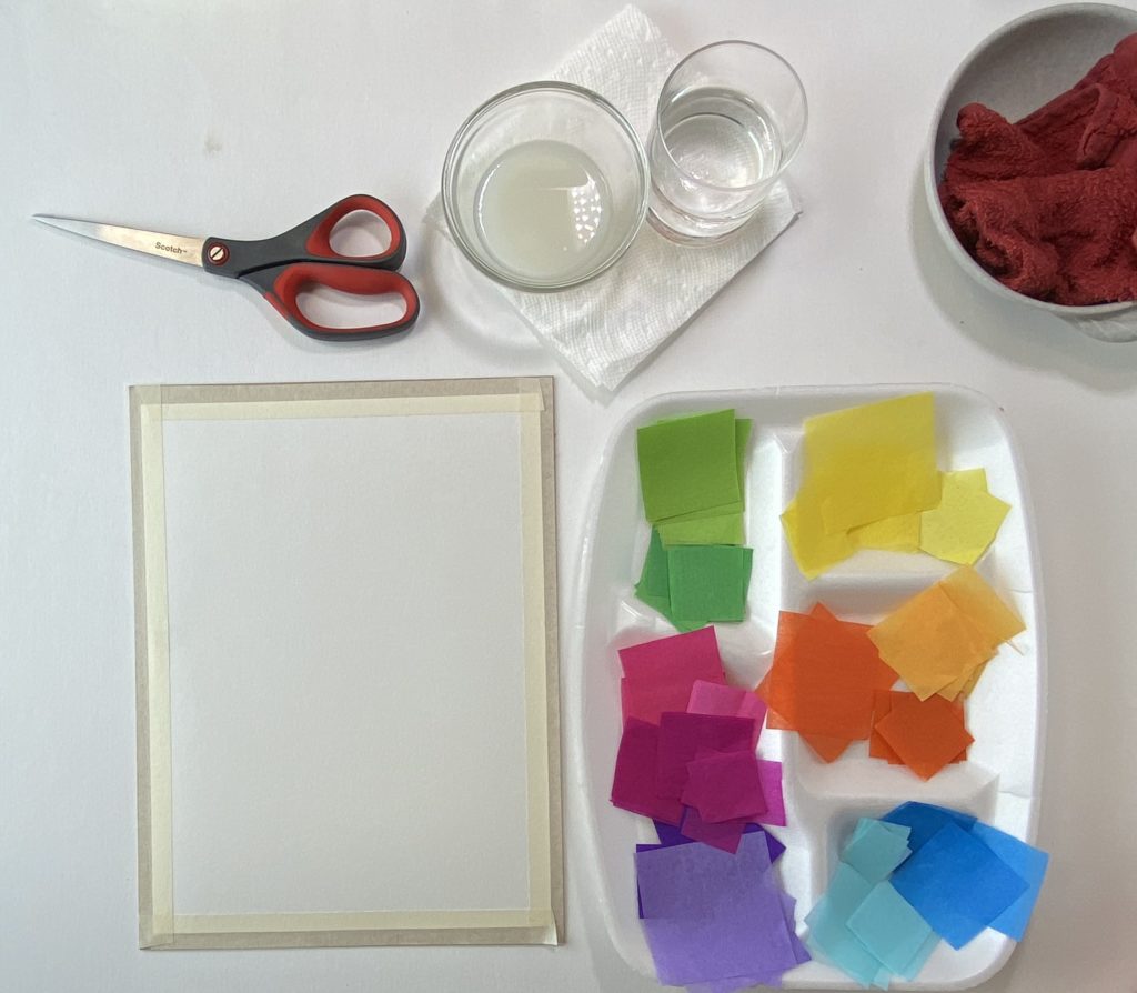
The materials used in this project:
- Tissue paper in a variety of colors
- Heavy white paper
- Liquid starch
- Scissors
- A paintbrush
- A damp towel to clean fingers
- A cup with water
- Optional: a piece of cardboard or other stiff and flat surface, masking or artist’s tape, a black marker
The steps taken to create this piece:
- Cut squares out of your chosen tissue paper colors.
- Using a paintbrush, lay down a good coat of laundry starch on your base paper
- Begin putting down squares of color using a delicate hand and a paintbrush to assist. Be aware of the color combinations, balance of positive and negative space, value and transparency.
- While placing squares, add more starch to places that require it, to properly adhere the tissue paper.
- When you feel that your piece is complete, coat the top with another layer of laundry starch to seal it
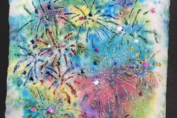
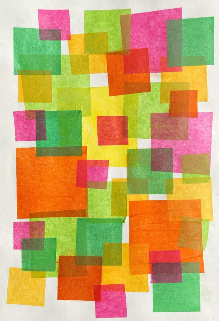
Here is the completed piece:
Some of the color bled from a few squares of tissue paper, different brands and manufacturing processes assure that not all colors will stay on their original paper when exposed to the liquid starch. I think it looks interesting, but if you’re looking to avoid that color transference, be sure to test your tissue paper with starch before you begin your final art piece.
When your piece is dry you will understand my admiration of the marriage of tissue paper and liquid starch it finishes wonderfully. Each time I use this method the reaction that liquid starch and tissue paper have bonding to each other is consistent, yet the end results of the projects are totally different because of the color and subject or design.
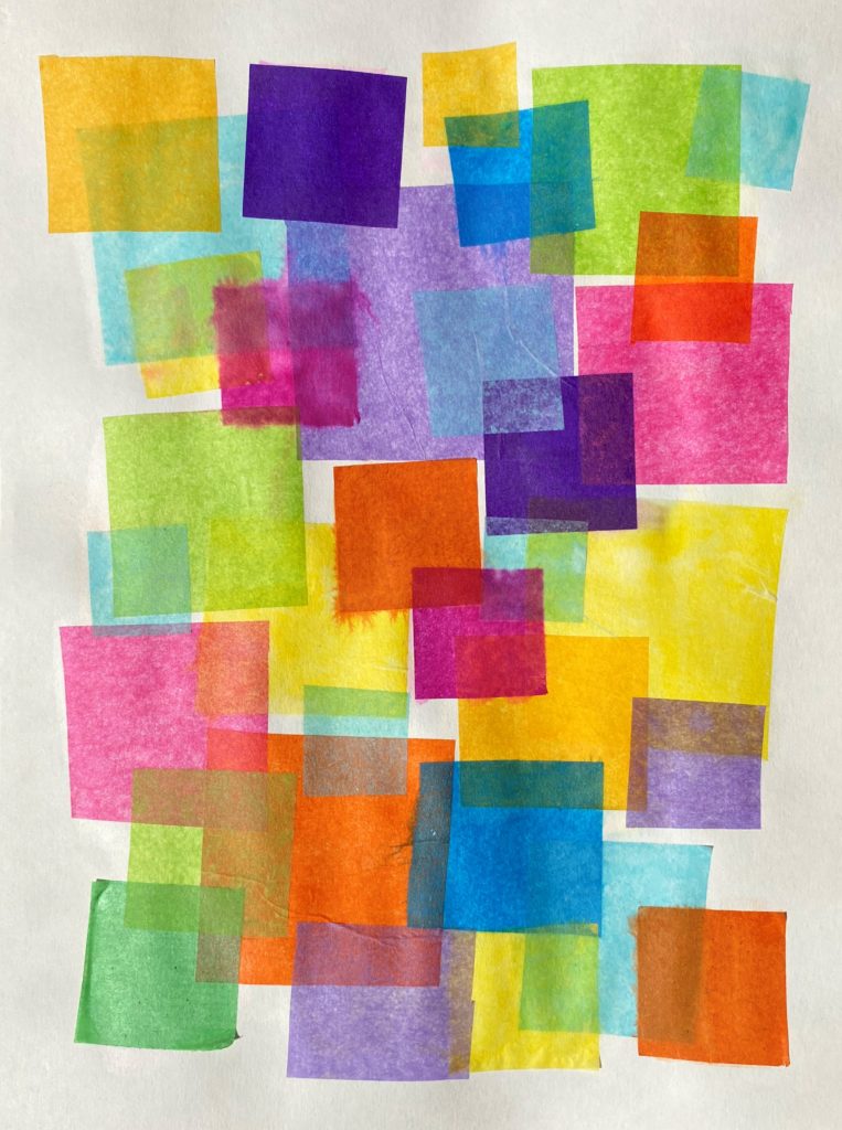
We overlay colors in many ways with many art materials, such as paints and pastels, that require more careful planning and application when it comes to achieving that transparency. This process with tissue paper achieves that transparency with little effort.
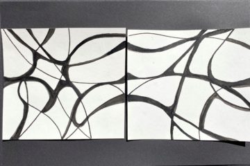
I did overthink this process as shown in the example below, with black lines drawn in.
The piece became overdone, and the color transparency was lost, but I learned that I needed to edit myself and that I could turn this into something I liked more with some black marker. Just more proof that the challenges of ideas and efforts can, through practice, turn into knowledge. We can always try something again and learn from past trials, whether we believed those trials to be successful or unsuccessful.