Using watercolor as a background is the perfect beginning to so many artworks. The unpredictability and movements of colors will always give you a good base for your art.
After seeing a photo of a with rolling hills and the impression of moving light within it, I had an idea to do a gentle landscape with light colored highlights. The background would be watercolor and, of course, I wanted to use an unusual mark making material/tool for the highlights.
When I was finished creating the basic scene with green and blue watercolors on watercolor paper, I went to my white printing ink to replicate the feeling of gentleness I saw in the original photograph. What could I use to imprint that ink and attempt that moving light on the painting?
My choice of tool for the “mountains” was corrugated cardboard, peeled back so the inner ridges showed. I wanted to try something that was repurposed, readily available, and would leave interesting marks.
I cut the pieces of corrugated cardboard into curvy, wavy shapes for my printing, knowing when I cut them that the lines would still be straight. But even though I knew, I still “tricked” myself with those curvy pieces when I went to create the mountainous feel. So, while imagining curvy lines during my imprint process, I ended up with straight lines almost resembling fences or gates. As I continued, I tried very hard to change this look and get a slanted result.
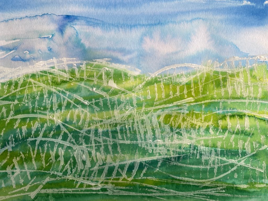
I wasn’t unhappy with my finished piece, but the geometric “tilt” was too far off from my original viewpoint. So, as always, I started again. Practice and experience make you a more confident artist, so I got down to more practicing.
Because I had done this before, and I learned what worked and what needed adjustment, it was much easier to produce my idea. This time my watercolor was stronger. I cut the corrugated cardboard in a more slanted, or angled, way to get the marks I wanted. Then I decided to change my printing “ink” from white to brown tempera paints.
I know, in the video it looks like I am using melted chocolate for ink! I took some of the dark brown and added white, to vary the tone and get that highlight look I wanted.
Well, I was having so much fun with my mark making, I almost got too carried away with my ink and cardboard tools. I thought I had overdone it again, too many lines and too much ink. So, I took my own advice and stepped away from my artwork for a while. When I came back to it, I saw it from a distance to gain a new and different view.

That’s all it took for me to be happy with both pieces. Once I lay the pictures next to each other, I could admire the difference between the two, find the delightful parts of both, appreciate my efforts, and enjoy the results.
The materials I used in this project:
- White watercolor paper
- Blue and green watercolor paints
- Brown and white tempera pains (mixed in different ratios to create three different shades of brown)
- A large paintbrush
- Corrugated cardboard, cut into small shapes and peeled so some of the corrugation is exposed
- A plate or paint palette
- Paper towels or an artist’s towel
Optional Materials are:
- Artist’s tape
- A easel or other stiff backing
The steps I took were:
- I painted a layer of water on my paper.
- On top of the water, I painted blue for the sky and greens for the hills, allowing the watercolor to move and blend in a natural way.
- After the background watercolor dried completely, I used my cut and peeled corrugated carboard to begin making marks with the brown tempera paints.
- I made marks to create the hills, focusing on dimensionality by bringing in lightness with the layering of the different tones of brown.
It’s important for artists to be curious, inventive, sometimes outrageous, always open to self-correction, and trying as many times as it takes to make the vision come true. This also means seeing goodness in everything, not just in our artwork, but in all that’s around us.